

theme property. The
theme property allows you to set common styles such as the font, color and
border styles.
Overview
Embed is a composition of UI components such as a Payment Header, Content and Lists. These components can change over time and so we therefore do not support direct styling of these. The following diagram shows an example of how basic theming is applied. Embed styles are derived from the theme values you provide.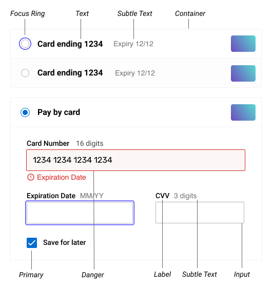
Usage
To apply a theme, embed can be passed an Object containing Theme Options. The theme options will override the default theme.Options
Fonts
Fonts can be customized with a valid CSS property.Colors
Colors are named semantically, for exampleprimary or danger. This allows us
to update introduce new features or UI elements without explicitly requiring you
to update your theme. As an example, we may introduce a ‘Default Card’ button at
a later stage that would be based on the danger set of colors.
Borders Widths
Borders can be set using an alias ofthin for a 1px border width or thick
for a 2px border width.
Radii
Radii can be set to eithernone, subtle or rounded. These aliases
correspond to 0, 2px and 4px. Setting the radii to none will remove it
entirely.
Focus Ring
The focus ring is set using a CSSbox-shadow instead of the default browser
focus ring. It can be overridden, but we advise at least keeping a visible focus
ring for accessibility. This will override any focus styles set elsewhere in the
theme.
FAQ
How do I load my own CSS files?
How do I load my own CSS files?
We currently do not support adding your own styles directly via CSS. Using a
theme allows us to roll out updates and ensure compatibility with new
features.
What browsers are supported?
What browsers are supported?
Theming is currently supported in all modern browsers including Microsoft
Edge. Some browsers like Internet Explorer 11 are not supported, and in these
the default theme will be used.
What values can be set?
What values can be set?
Values can be a valid CSS property value. e.g.
colors.primary could be a
hex, RGB or HSL. You can also have multiple shadows for a focus ring, e.g. 0 0 0 2px white, 0 0 0 4px green